


By Canvas & Ivy
Picture a walnut sideboard against cognac-colored wallpaper, an ivory ceramic lamp at one end and a loosely arranged stack of favorite books at the other. The autumnal note comes from the relationship between brown, cream and wood grain—not a collection of seasonal decorations. Change the flowers or the table linen, and the room can take on a different mood without losing its identity.
That is one appealing way to interpret fall 2026’s interest in warm colors, layered materials and collected furnishings. It is not a prescription for every home. You might prefer the crispness of blue and white, live somewhere autumn brings little temperature change, or want your rooms to stay visually spare. The useful question is not whether your home looks warm enough, but which colors, patterns and materials you would enjoy living with beyond one season.
Fall 2026 Ideas to Adapt to Your Home
The room concepts below take warm wood, earthy color and contrasting finishes as starting points, rather than rules. Some are deliberately enveloping; others keep pale walls and use only a few tobacco, ochre or olive accents. Their visual effects are matters of taste, influenced by the room’s architecture, daylight and existing furnishings.
For another seasonal perspective, browse Homes & Gardens’ fall 2026 trends, then choose the ideas that relate to your own rooms rather than trying to reproduce an entire forecast. A useful shortlist might contain just three elements: a patterned wall, a darker wooden table and a shaded lamp.
If you are deciding whether the walls need pattern or simply color, our comparison of textured wallpaper vs painted walls offers another way to think through the choice. For a broader range of motifs, explore our 2026 wallpaper trends guide.
1. Warmth as Foundation—Beyond Seasonal Swaps
The 2026 U.S. Houzz Fall Design Trends Report presents warm wood, earthy color, natural materials and layered vintage pieces as foundations of its design outlook. This is a U.S.-focused perspective, not evidence that every region or household wants the same look. Borrowing one element can be more satisfying than adopting the whole palette.
A pale sitting room with tobacco accents
Imagine existing white walls, a pale gray sofa and a light wood floor. Instead of replacing them, introduce a tobacco-colored chair, oatmeal curtains and a dark brown lamp base. A small olive cushion could connect the chair to a botanical artwork. Keep the largest areas pale if that is what you like; warmth does not have to mean dark walls.
For pattern, choose one clearly legible motif rather than several equally prominent prints. A broad botanical on the wall could sit beside plain upholstery, while a fine stripe on a cushion provides a smaller-scale counterpoint. Arrange the chair so it participates in the seating group, with a side table within reach, rather than leaving it as a decorative object in an unused corner.
A shaded floor lamp beside the chair makes the layout useful after daylight fades. In a hot climate, translate the palette through lightweight curtains and smooth cotton covers rather than heavy throws. For a rental, begin with furniture, lamps and textiles you can take with you. Replacing flooring, staining joinery or repainting walls introduces a different level of commitment.
2. Earthy, Layered Color Palettes
A cognac dining room with a crisp ivory counterpoint
Start with a cognac wall, a brown wooden table and ivory chair seats. Saddle Legacy Wallpaper offers a leather-look design in cognac and chestnut, with fine crease imagery rather than a bold floral or geometric motif. The leather effect comes from the imagery; do not assume the wallpaper is made from leather or has a raised texture.
For this hypothetical room, keep the table linen plain and introduce a single contrasting detail, such as a dark green bowl or blue-gray glassware. Those cooler notes are optional, but they offer an alternative to making every surface another shade of brown. A cream pendant shade would provide a pale shape above the table; a brass fixture would create a more decorative focal point.
Before choosing wall coverage, look at the dining room from the adjoining space. If an open doorway already frames a busy living-room rug, a quieter wall design may be preferable to another large motif. Conversely, a largely plain open-plan space could accommodate a more expressive dining wall. There is no need to repeat the exact same brown everywhere; compare samples together and decide whether their differences appeal to you.
Place a sideboard where its doors and drawers can open without colliding with occupied dining chairs. Try the arrangement with chairs pulled back, not only tucked neatly under the table. A room can look beautifully layered in a photograph yet be frustrating when serving dinner.
For a more obviously patterned alternative, Emberline Homestead uses diagonal plaid blocks in ember-red, burnt orange, saddle brown, cream and charcoal. It would be a bolder, more seasonal-looking choice. Ciderhouse Carnations, with russet and cider-red blossoms on wheat, offers a floral route. Choose between them by imagining the room with your everyday dishes and furniture, not only an autumn table setting.

3. Material Contrast & Textural Tension
ELLE DECOR’s fall 2026 trend coverage highlights deeper wood tones, earthy greens and contrasting materials. As a styling idea, this is useful because it encourages you to consider how surfaces relate, rather than buying several pieces with the same finish.
A reading corner with a softly drawn feather backdrop
Try a smooth wooden chair frame, a softly woven seat cushion and a glossy ceramic table lamp. Behind them, Featherfall Wallpaper supplies watercolor feather imagery in browns, beiges and creams. Its drawn detail could provide visual texture while the furniture supplies the actual tactile variety.
Keep the layout simple: chair, table, light and enough free floor space to approach the seat comfortably. Put the lamp where its shade does not block the artwork or dominate the chair’s silhouette. Check it while seated, since an exposed bulb that looks attractive from the doorway may be distracting at eye level.
Pattern scale matters here. Fine feather lines may become less distinct at a distance, so judge a sample both close up and from the entrance. If you want the wall to be the main feature, avoid covering most of it with a tall bookcase. If you prefer the pattern to remain secondary, let shelves and framed art interrupt it.
The trade-off is visual activity. A veined table, patterned rug, ribbed lamp and detailed wall can compete in a small corner. You need not reject any one material; edit their distribution. For example, use a plain rug beneath the chair and keep the ceramics together on one shelf, leaving another surface clear.
4. Dark Wood & Moody Accents
A lounge built around one dramatic wall
For a more theatrical interpretation, pair a dark wooden media cabinet with camel upholstery, a cream rug and Falling Ember Skies Wallpaper. Its crimson, ochre, violet and midnight-blue bands against a star-speckled black backdrop would make a distinct statement. Pull just one of those colors into a cushion or artwork rather than matching every accent to the print.
Choose the focal wall according to the furniture arrangement. Behind the sofa, the wallpaper remains visible around the seating. Behind a television, the screen interrupts the design and becomes part of the composition. Neither is automatically wrong, but sketch the main furniture outlines over a pattern image before deciding.
A small lounge can use dark colors if you enjoy an enclosed mood; it does not need to imitate a bright room. Equally, a large room does not require dark finishes. Try balancing a dark wall with a pale sofa if you want a pronounced silhouette, or brown upholstery if you prefer a closer tonal relationship.
Use table and floor lamps to light the places where you sit, read or put down a drink. A gold-colored pattern should not be treated as a substitute for lighting. If you prefer the abstract streams of Molten Cascade, choose it for its black, gray, orange and gold imagery; confirm the actual surface finish separately rather than assuming metallic-looking artwork will reflect light.
For a lower-commitment version, leave the walls alone and introduce a dark freestanding cabinet, a plum cushion and an ochre throw. There is no need to stain existing woodwork to test whether you like this direction.
5. Lived-In, Collected Interiors
A botanical bedroom with room for mismatched furniture
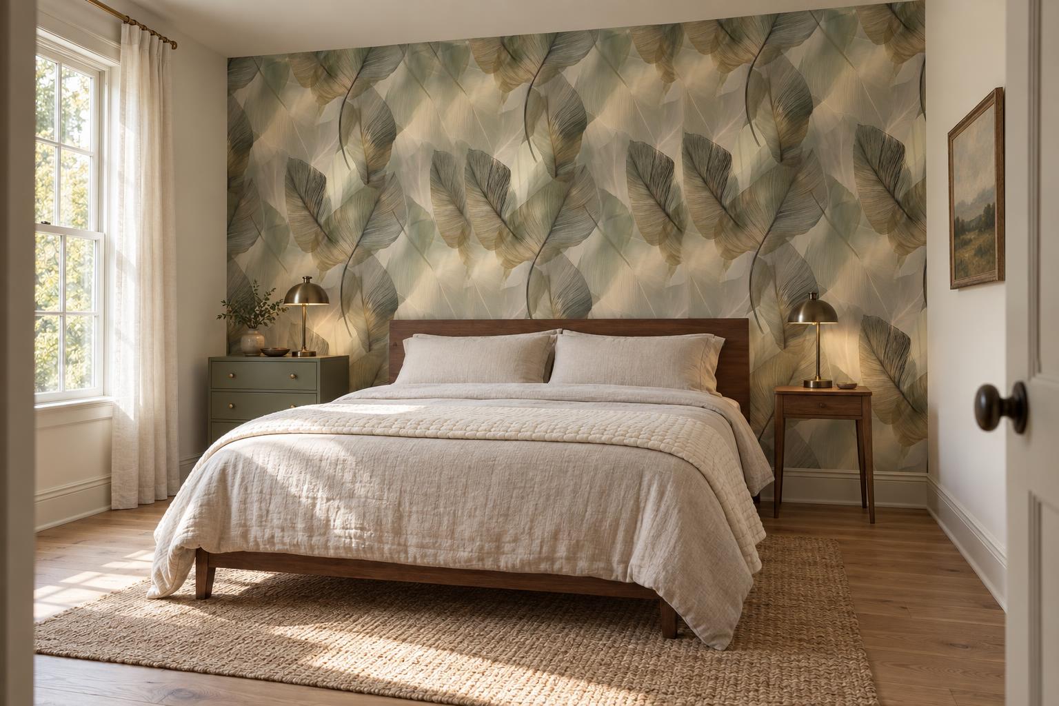
Consider a wooden bed, a painted bedside chest and a simple metal reading lamp. A collected bedroom need not contain antiques or tell an elaborate story. The interest might come from a framed postcard, a quilt you already own or a chair moved from another room.
Opaline Leaffall Wallpaper has overlapping banana-leaf imagery in taupe, olive-gray, champagne and smoke tones. In this scheme, its fine ribbing and layered shapes would provide a patterned backdrop for plain oatmeal bedding. Those are visual qualities, not claims about translucency or the physical texture of the material.
Decide how much pattern you want to see from the doorway and from the bed. A headboard can conceal the center of a feature wall, so a large motif may be cropped more than expected. Full-room pattern creates a different composition, especially where doors and wardrobes break up the walls. Compare both approaches using the actual furniture positions.
For a stronger contrast, Verdure Nightfall combines oversized florals and foliage with a deep teal ground. In that version, try ivory bedding, one moss accent and restrained bedside accessories. The pale flowers already supply contrast, so extra patterned cushions are optional.
Give each side of the bed the surface space and light it needs, even if the furniture does not match. Similar lamp heights can create a more orderly arrangement; different heights can look deliberately informal. Check the switches and the route around the bed before adding another decorative piece. These choices concern appearance and everyday use, not sleep outcomes.

6. Warm Details in Transitional Spaces
A softly layered entryway in ochre, flax and wood
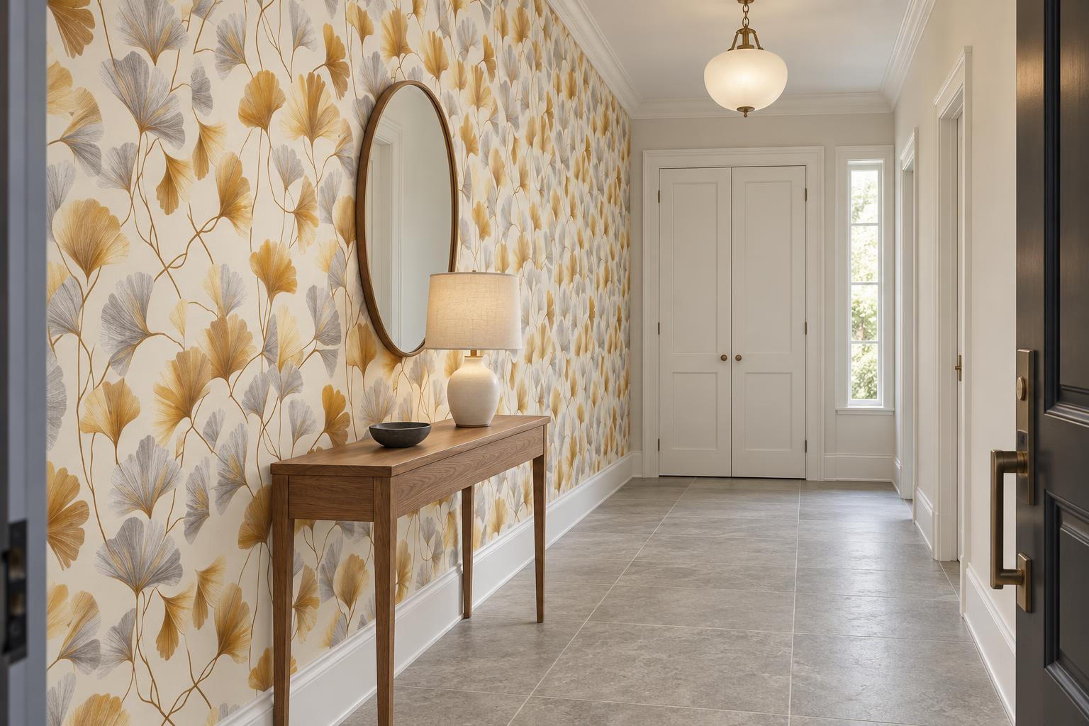
An entryway offers a compact place to explore pattern, but its doors, switches and storage deserve attention first. Imagine Aureline Fanfall Wallpaper behind a narrow wooden console, with a flax-colored lampshade and a shallow dark bowl for keys. Its fan-shaped leaves and gold- and silver-inspired colors would set up a different rhythm from the small objects on the console. Do not infer a metallic finish from the palette alone.
Because the leaf composition is generous, check how much of it remains visible between the console and mirror. A large mirror might obscure the most interesting portion; a smaller oval or a simple framed print could leave more pattern exposed. If the entry is particularly narrow, skip the console and consider a shallower storage solution that does not obstruct the route.
A frosted pendant or shaded ceiling fixture would suit a softly lit interpretation. Where a table lamp is practical, plan the cord route before settling on its position. Avoid relying on a decorative lamp if it leaves the coat-storage area difficult to see.
For homes with crisp white trim and cool stone floors, let the wallpaper’s silvery notes connect to those existing finishes. A wooden bowl or tan seat cushion can introduce the warmer accent without replacing the floor. If you prefer minimal ornament, use a plain bench and let the wall carry the detail.
In a rental where wall changes are not permitted, translate the same palette through a freestanding bench, a runner suited to the doorway and framed botanical art. Mirror mounting, shelving and other attachments still need appropriate fixing methods and any required permission.

7. Designing for Evolution
A blue-and-wood guest room that can also be a study
Warm styling does not require abandoning blue. A hypothetical guest room with Windham Hydrangea Wallpaper could combine pale blue and white blooms with a wooden desk, cream curtains and an olive chair cushion. The pattern’s foliage provides another color to draw from without adding autumn motifs.
Set out the desk, guest bed and storage before choosing the patterned wall. A wallpapered desk backdrop may suit a room used mainly for work, while a bed-wall installation could make more sense when guests stay frequently. Check what is visible on video calls and whether a tall monitor hides the portion of the design you most enjoy.
For mixed use, give work supplies a defined home so the bedside table does not become overflow storage. A movable stool might serve as an occasional seat or luggage surface, provided it suits those uses. Choose furniture around the tasks it needs to perform, not a vague promise that the room will be future-proof.
No motif has a guaranteed stylistic lifespan. A hydrangea print can remain a favorite or become something you want to change. The useful flexibility comes from furnishings you can rearrange and colors you are happy to revisit, rather than an assertion that one pattern will work forever.
Reader Decisions & Trade-Offs
Before committing to a room concept, separate choices by how easily you can change them. Cushion covers and table linens are straightforward to swap. Furniture is portable but can still be expensive or difficult to move. Wallpaper, paint, flooring and built-in cabinetry require more planning and may involve restoration costs later.
For rented or short-term accommodation, check the lease and obtain any necessary permission before changing walls. Do not assume damage-free removal, including for products described as peel-and-stick. Review the current instructions for the specific wallcovering, wall condition and finish, and follow the specified sampling or testing process. If those requirements cannot be established, keep the design changes off the walls.
Our guide to peel-and-stick wallpaper mistakes you can avoid is a useful next read when comparing options. For any room, place color and material samples beside the finishes that will stay. Look in daylight and under your normal evening lamps; select the combination you like in both conditions, rather than judging it only on a screen.
Checklist: Layering Warmth for Fall 2026
- Choose a starting point: Identify a floor, sofa, artwork or cabinet you want the scheme to accommodate.
- Choose the main pattern: Decide whether it should be a subtle backdrop or the room’s focal feature.
- Vary scale deliberately: Try a broad wall motif beside a smaller textile pattern, with some plain surfaces between them.
- Plan the evening view: Position lamps around actual activities and check glare from seated positions.
- Test the layout: Open doors, pull chairs out and walk the routes you use daily.
- Set a commitment limit: Decide which changes you are willing and permitted to make before shopping.
When you are ready to compare wallcovering options, read types of wallpaper: how to choose the right wallpaper for your space, then check the current product-specific requirements.
FAQ: Adapting Fall 2026’s Trends
Can I keep my gray sofa and cool-toned flooring?
Yes. Try a wallpaper containing both gray and warmer notes, or introduce cream, muted olive and a medium brown through textiles and furniture. Compare them together rather than assuming all earth tones coordinate. You may prefer the contrast of cool gray against cognac to a closely matched neutral scheme.
Do I need several patterns for a collected look?
No. A plain wall, varied picture frames, a wooden chest and a patterned chair can feel collected without layered prints. If your wallpaper is detailed, try keeping curtains and the largest upholstery pieces plain. Empty space is a valid part of the composition.
What if a whole patterned room feels like too much?
Choose a wall with a clear architectural boundary, such as the wall behind a bed, rather than stopping the pattern arbitrarily. Alternatively, leave the walls unchanged and explore the palette through art. A smaller intervention is not a lesser version of the idea.
How can botanical styling avoid looking strictly autumnal?
Try olive-gray foliage, pale blue flowers or cream-and-taupe leaves instead of orange foliage. Our guide to decorating with nature-inspired wallpaper offers more botanical directions. Pair your choice with everyday objects rather than relying on seasonal props.
The most useful fall update may be one wall, one lamp or a better arrangement of furniture you already have. Start with the room you use and the colors you enjoy, then let the seasonal inspiration supply possibilities—not obligations.
Sources and further reading
- 2026 U.S. Houzz Fall Design Trends Report
- 6 Fall 2026 Interior Trends to Watch, According to Experts
- These Are the 7 Biggest Fall Trends For 2026 | Homes and Gardens
Cover image: AI-generated design concept; product photographs appear alongside their catalog links.