


By Canvas & Ivy
A plain white tub could look entirely different beside warm off-white tile, a wood-faced vanity and sage botanical pattern. The transformation comes from how those elements relate—not from replacing everything. Start your bathroom renovation with one feature worth keeping, then give it a deliberate setting.
These five bathroom renovation ideas begin with an existing tub, tile, basin or vanity. Each connects a focal point with a palette, pattern, lighting and storage. Where wallpaper is proposed, explore the look first, but confirm the exact product and wall location are suitable before ordering.
Before choosing a look, choose what stays
Record room dimensions, fixture positions, tile undertones, daylight and storage needs. Note what interrupts your routine: a door that gets in the way, toiletries without a home or insufficient counter space. Set a working budget and discuss shower-versus-bath preferences before choosing finishes.
Choose the scope that best fits your project:
- Decorating refresh: retain existing surfaces and use permitted textiles, accessories and furnishings.
- Selective replacement: change selected elements while retaining the layout.
- Configuration renovation: reconsider fixture positions, circulation and storage together.
Keeping the layout does not mean ignoring systems. In the 2025 U.S. Houzz Bathroom Trends Study, 36% of respondents changed or planned to change their layout, while 61% upgraded systems. The survey covered 1,737 U.S. homeowners on Houzz with completed, ongoing or planned projects—not all U.S. households. It does not establish savings from retaining a layout.
If you rent, check lease requirements and obtain written permission before alterations. For any project, identify what you will keep, what you want to change and which decisions need product documentation or professional assessment.
1. Warm woodland: frame a white tub with wood and botanicals
Keep the white bathtub and warm off-white tile. Picture a brown wood-faced vanity below a simple mirror, with muted sage botanicals on a suitable wall. Warm white, green and brown could make a cohesive palette without asking every surface to be decorative.
Let the vanity wall carry the composition. Pair plain tile with one restrained metal finish, then compare the botanical motif with the actual mirror dimensions. A broad leaf might look generous beside a narrow mirror but become an indistinct fragment behind a wide cabinet. Judge the visible wall, not an empty rectangle.
For a delicate variation, consider Meadow Notes Wallpaper. Its fine daisy sprigs, muted sage ground, white petals and golden centers offer connections to creamy tile and warm wood. The restrained spacing could suit a scheme where the vanity should remain prominent. Confirm the selected wallpaper construction is suitable for your proposed bathroom location.
If you prefer leaves to flowers, compare the silhouettes in our botanical and floral collection, keeping your chosen green-and-white palette consistent.
Imagine simple mirror lights with plain shades rather than another botanical detail. Add an ambient lighting layer, with electrical requirements and fixture suitability reviewed for the room. Give bottles and grooming tools assigned storage so the patterned wall does not become a backdrop to crowded counters.
If a white vanity must stay, introduce brown through a wood-toned tray rather than a stool that competes for floor space. Compare cream tile, wood tones and towels together: if pink-beige towels seem disconnected from the sage, try ivory instead. You need not replace a large retained feature to resolve a small color mismatch.
Keep: tub and tile. Change: the vanity composition and selected accents. Verify: cabinet fit, lighting and wallcovering suitability.

2. Graphic refresh: make colored tile the anchor
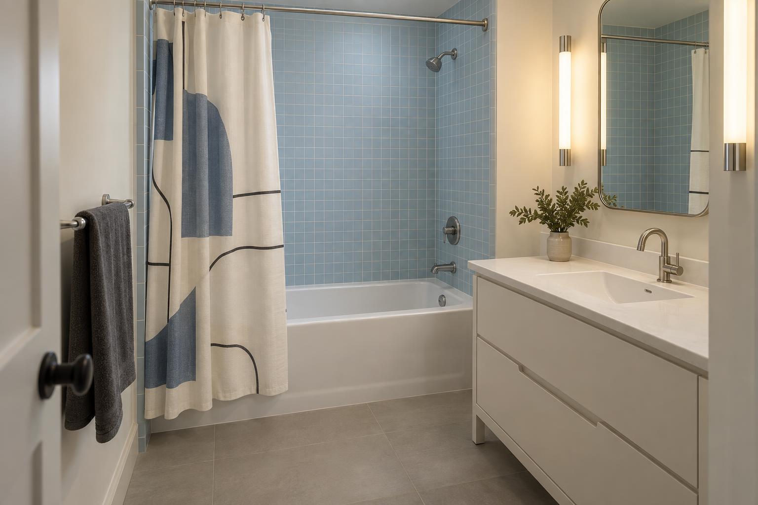
Picture pale blue tile around a white bathtub. Instead of disguising it, build around ivory, muted blue and a small amount of charcoal. Let one graphic element near the vanity or across the shower curtain become the focal point—not a collection of matching blue objects.
A medium-scale geometric could contrast with the tile grid. Broad ivory shapes and sparse charcoal lines would connect the white tub to darker accessories without reproducing every shade of blue. Use wallpaper only where compatibility is confirmed; otherwise, a patterned shower curtain can carry the idea.
Keep cabinetry visually plain. A compatible neutral can look more deliberate than an almost-matching blue. If repainting the vanity is under consideration, identify its surface and condition first. Benjamin Moore’s bathroom-vanity tutorial outlines preparation and painting, distinguishes finished and unfinished wood, and directs laminate owners to separate guidance. Follow instructions for the actual cabinet surface and coating system rather than treating one tutorial as a universal specification.
Study the mirror, lights and vanity as one arrangement. A rectangular mirror could echo the tile geometry; a rounded one could soften it. Slim, plain light fittings could leave the graphic pattern prominent. Work within the available wall dimensions and electrical plan rather than copying an inspiration image’s proportions.
For a less graphic variation, explore coastal powder-room pattern ideas while keeping the existing blue tile as your starting point.
In a decorating-only refresh, retain the cabinet and repeat charcoal in one accessory. Avoid decorative tile, a busy curtain and elaborate artwork all demanding equal attention. Let supporting pieces repeat the main pattern’s palette, not its complexity.
Keep: colored tile. Change: one graphic element and supporting textiles. Verify: permissions, cabinet surface and lighting alterations.
3. Quiet stone: make surface layout the feature
Start with a simple vanity whose proportions still suit the room. Build around chalk, soft gray-beige and a restrained dark accent. Proposed large-format tile with low-contrast pattern could provide a broad, understated rhythm, with the tile layout—not wallpaper—as the feature.
Pair those surfaces with plain cabinet fronts and one softer-looking accent, perhaps a woven basket in an appropriate location. Choose either expressive veining or pronounced woven texture as the main detail. Several different stone patterns could dilute the quiet composition.
Ask the designer or installer to draw tile cuts around corners, openings and fixtures. On a short wall, a centered layout and an offset starting point may leave very different edge pieces. Compare both from the doorway. The largest format is not automatically the most convincing choice for a compact room.
If you have a historic ceramic floor, reconsider replacing it. The National Park Service’s Preservation Brief 40 favors preservation and repair of historic ceramic floors. It warns that plumbing changes or differently shaped replacement fixtures can damage tiles or expose untiled areas. This conservation guidance does not establish your floor’s condition or verify shower waterproofing.
In that adaptation, keep the floor and borrow chalk and gray-beige for towels and accessories. Let the existing floor pattern supply the detail rather than layering a competing stone effect above it. A narrow dark mirror frame could provide enough contrast without introducing dark cabinetry too.
Plan mirror task lighting, then compare samples under the intended lighting and available daylight. Check their relationship with the retained vanity, not merely with one another. Fewer visible joints can be an aesthetic goal, but are not proof of easier installation or lower maintenance.
Keep: the simple vanity and any existing flooring worth preserving. Change: selected surfaces and one accent. Verify: tile layout, condition and application details.
4. Jewel-box powder room: give one pattern the spotlight
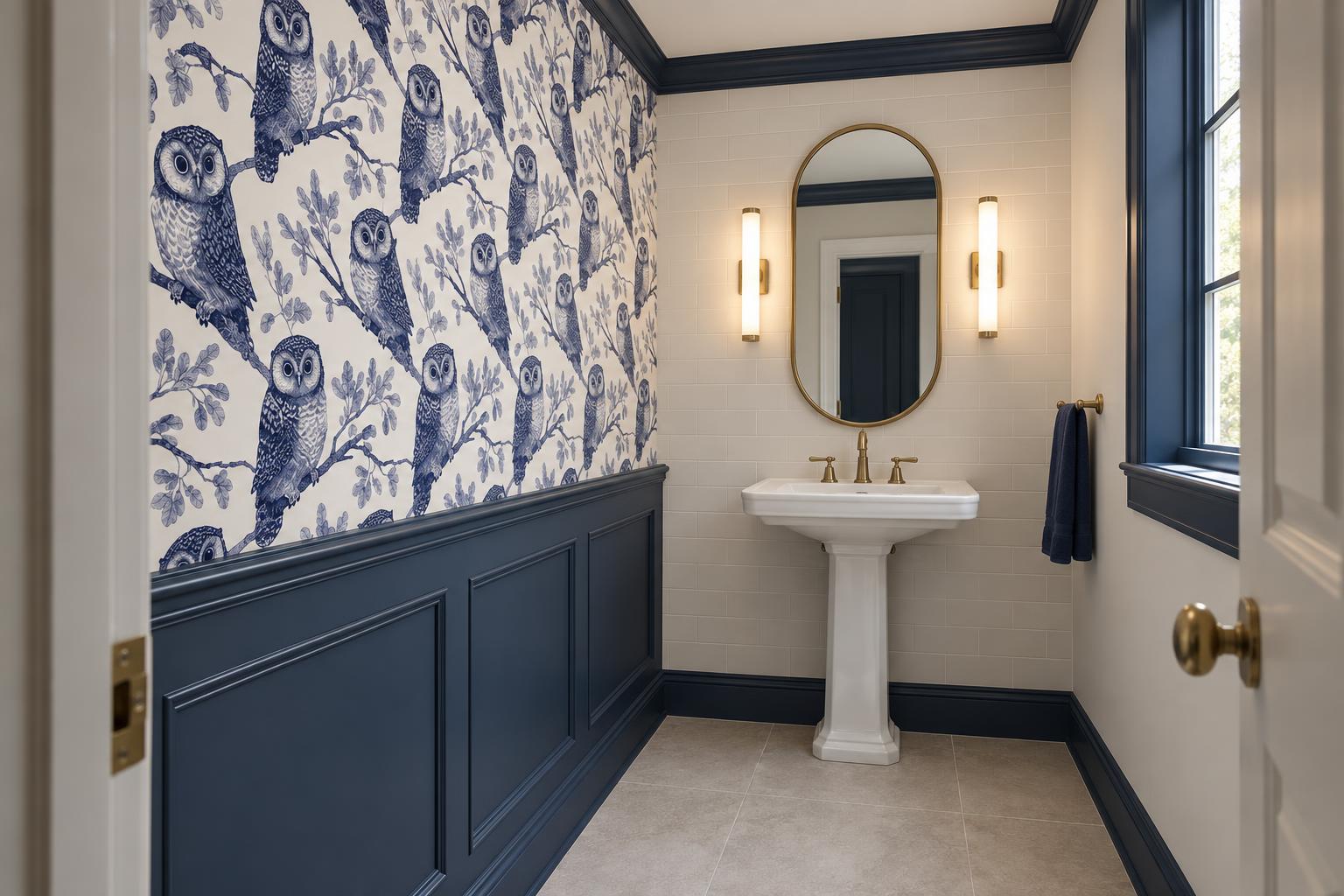
Keep a plain basin and imagine ink blue, white and a muted brass-colored accent around it. An illustrated pattern could become the focal point, supported by a restrained mirror shape and plain adjacent finishes. A small room need not default to a tiny motif.
Nocturne Branchkeepers Wallpaper features deep navy owls and branching limbs on a white background, with etched-looking feather detail. The contrast could connect a white basin to navy accents while giving the room a recognizable subject. Its enlarged artwork makes checking the composition around the mirror particularly important. Confirm application suitability separately from choosing the pattern.
Begin at the doorway. Which wall appears first? How much remains visible after accounting for the mirror, lights, basin and door opening? A distinctive owl could lose its intended effect if most of it lands behind a cabinet.
Try the doorway-view pattern exercise
- Sketch the visible wall in approximate proportions.
- Mark mirrors, fixtures, openings and retained tile.
- Compare two pattern scales in the remaining areas.
- Decide whether recognizable subjects or a continuous field of color matters more.
Use this exercise to choose the composition, then confirm actual pattern dimensions and placement possibilities before ordering. Remember the side wall: it may offer a less interrupted view of the illustration than the wall behind the basin.
Compare one focal wall with a fully patterned room. A single wall could frame the illustration; surrounding pattern might create the enveloping effect you prefer. Our wallpaper focal-point ideas offer other ways to approach that choice.
Pair useful mirror lighting with the decorative mood. A dramatic ceiling fitting need not carry the whole lighting concept. If wall alterations are prohibited, translate ink blue and white through permitted artwork and towels, keeping the basin as the plain counterpoint.
Keep: the plain basin. Change: its backdrop. Verify: motif placement and product suitability, including basin splash exposure. The absence of a shower does not settle those questions.

5. Shared bathroom: make storage part of the composition
Keep a serviceable vanity and make its storage-and-mirror arrangement the focal point. Imagine warm white, dusty blue and medium wood, with plain cabinet fronts and a quiet, small-scale pattern in a textile. Leave the mirror wall comparatively simple.
Begin with objects and routines. List each person’s daily items, shared supplies, spare towels and things that could live elsewhere. Separate morning essentials from occasional supplies. Then note whether people need the basin simultaneously or mainly need access to their own belongings.
Those answers are more useful than assuming two sinks represent an upgrade. Compare a larger vanity with your existing arrangement on a measured plan. Another basin could displace counter area; deeper cabinetry could occupy space you wanted to leave open. Mark drawer extensions and door swings, not just the cabinet footprint.
Imagine two people sharing a narrow room: one needs grooming tools close at hand, while the other needs somewhere to set a toiletries bag. Dedicated storage divisions and a clear counter area might suit that brief better than another fixture.
Build the mirror-lighting concept around where people would stand. Coordinate towels in two colors rather than adding several competing patterns. If the existing cabinet has open shelves, use a consistent container style and leave frequently reached items accessible rather than hiding everything for appearance’s sake.
For a warmer version, repeat the wood tone in one mirror frame; for a more graphic version, choose a slim dark frame and a dusty-blue striped textile. Discuss future household needs before finalizing the layout, and have a qualified project professional assess proposed accessibility features, fixture changes and circulation revisions.
Keep: the workable vanity. Change: storage organization, supporting pattern and palette. Verify: dimensions, circulation and proposed fixture alterations.
Where wallpaper belongs in your bathroom plan
Separate two questions: Where will the pattern look intentional? and Does current product documentation support this application? A beautiful composition answers only the first.
Start by comparing wallpaper types, then request guidance for the exact wallcovering construction, including substrate preparation, adhesive or backing, ventilation, moisture exposure and cleaning. Have the proposed location assessed against that guidance. Being outside direct splash exposure is not sufficient evidence of compatibility.
Do not equate peel-and-stick with rental suitability, or a wipeable description with waterproofing. Do not assume damage-free removal. Check permissions and wall compatibility, and do not specify wallpaper inside a shower or in direct splash exposure without explicit current evidence supporting the complete application.
If suitability cannot be confirmed, keep the concept and change its medium. A permitted shower curtain, towels or appropriately located artwork can carry the palette without changing the walls.
Make the fixture shortlist work as hard as the palette
Choose a finish family for visual coherence, but assess dimensions, controls, condition and installation compatibility separately. A fitting can look right and still be wrong for the project.
If retaining a compatible bathroom faucet, consider an aerator update. EPA’s WaterSense bathroom-faucet guidance explains that a labeled aerator can improve an existing faucet’s efficiency. Labeled bathroom faucets and accessories use no more than 1.5 gallons per minute, at least 30% below a 2.2-gpm baseline. Confirm accessory compatibility: that percentage concerns flow, not guaranteed household bill savings.
Apply the same separation to lighting. Select the visual direction, then review fixture suitability and electrical requirements for the actual room. A coordinated metal finish does not answer those technical questions.
Turn your favorite concept into a one-page room brief
Before ordering, record the decisions that hold the scheme together:
- The retained feature and intended focal point.
- Palette, pattern scale and material pairings.
- Mirror and ambient lighting concepts.
- Storage priorities and future household needs.
- Scope, budget, dimensions, permissions and unresolved technical questions.
Can you mix concepts? Yes. Borrow woodland colors for a storage-led shared bathroom, but choose one dominant pattern rather than competing focal points.
What comes before ordering wallpaper? Confirm samples, permissions and application suitability, then work through our wallpaper measuring guide. Check quantities against the chosen product’s dimensions and pattern layout rather than estimating from a room photograph.
Finally, gather your samples beside the feature that will remain. Compare them in the room’s light. Keep the combination that makes that existing element feel intentional while accommodating how you actually use the space.
Sources and further reading
- 2025 U.S. Houzz Bathroom Trends Study
- Preservation Briefs 40: Preserving Historic Ceramic Tile Floors
- How to Paint a Bathroom Vanity - Tutorial | Benjamin Moore
- Bathroom Faucets | US EPA
Cover image: AI-generated design concept; product photographs appear alongside their catalog links.